
How to choose the perfect white paint for your home

Do you find it hard to decide on the best shade of white paint?
When faced with many shade cards from all the different paint brands, many of us glaze over. I will share how to help break down the overwhelm and simplify your options, providing a more straightforward process for selecting your perfect shade of white.
As someone primarily associated with colourful interiors, you would think I am not keen on white; that is not the case. Finding the right shade of white allows the other colours in the room to shine beautifully, reflecting the light and increasing the perception of space. Firstly, I would suggest choosing paint with a good pigment base from a sustainable brand.

Colour & Design Consultation
Need a second opinion on the perfect white or wondering why they all look so different? I offer one-to-one colour consultations to help you feel confident in your choices. Whether in person (around Bath) or over a video call, we’ll look at your space, light and furnishings to guide you toward a shade that works beautifully in your home.
Before you go to the paint shop:
Look at the room and assess the light
Where does the sun rise and set?
Will you need to add more artificial light to the room?
When do you use the room the most?
Undertones
When considering white, it is the undertone that determines the shade. To help you get to grips with the term undertone, find a white sheet of paper, gather a few white objects around the house and lay them on the paper. You will quickly see the varying tones of yellow, pink, blue, green, or grey in each item. The same tonal changes apply to the appearance of paint. You can pick up a brilliant white shade card, place it next to other whites, and immediately see the tonal differences.

Where the light comes from
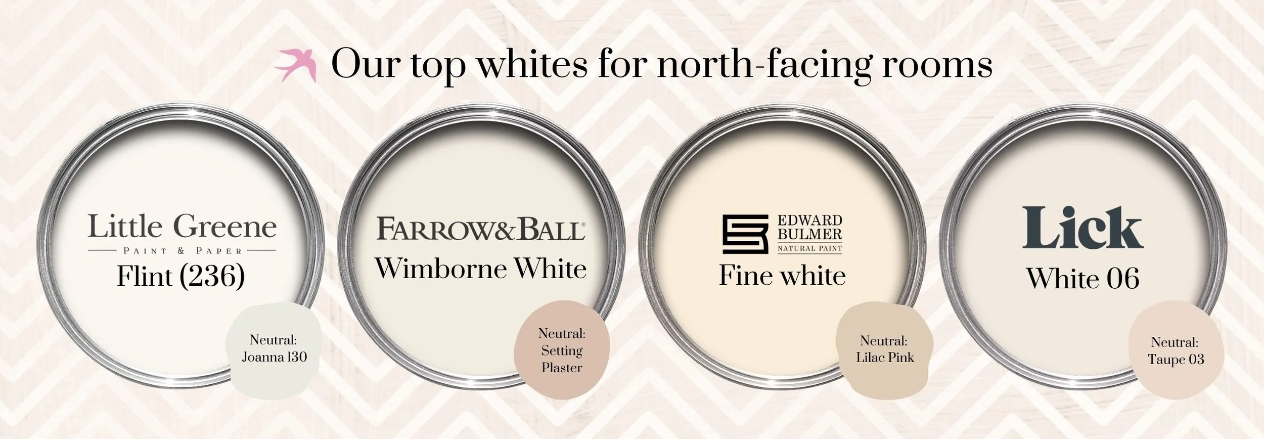
North-facing rooms are naturally darker, needing warmth from a white with yellow/pink undertones. A pink undertone is a good counterbalance between the grey shadows of a dark room, forming a gentle, balanced light.
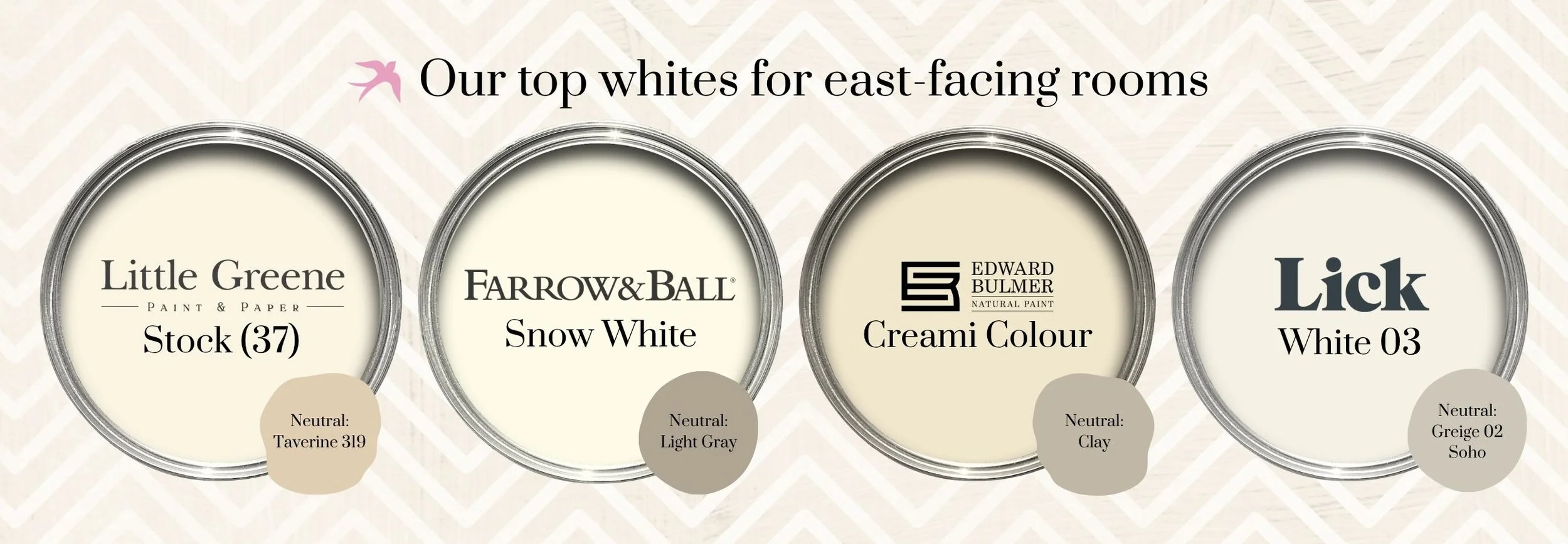
East-facing rooms benefit from the sun in the morning, and the light changes throughout the day, creating a colder shade in the afternoon and evening. Choose a white with a yellow undertone to help lift the light.
South-facing rooms have beautiful natural light, allowing you to maximise the feeling of light and space. Using a neutral white with undertones of blue will help absorb the light, keeping the room cosy.

West-facing rooms will be darker in the mornings, but the light shines later in the afternoon. Adding a yellow or grey undertone will soften the evening sun and lift the morning.

All around light! If you have good lighting throughout, I suggest using any of these three white paint colours.

The addition of artificial lighting:
Consider spreading any additional lighting around the room to help soften and create a warm feel. Dimmable lights are great, allowing for variation.
Traditional lighting creates a warm yellow glow, and most modern LEDs can shine a blue/white tone. I suggest you choose a warm white LED bulb creating a softer light that helps you select paint.

Other colours in the room
Consider the other colours going into the room. Furniture and furnishings will also affect the shade of white on the walls. If you have fabric samples or have the colours in shade cards, you can compare them against your white options.
Try using two different whites
I prefer to use two different whites in the room: ceilings and woodwork in one shade and a different shade for the walls. I use a warmer tone on the ceiling and woodwork to add depth, and if you have any cornicing, it will create shadow and distinction.

Paint brands
The paint market is growing, and the choices are vast. To help keep your sanity, I would advise you to start looking at 3-4 paint brands hoping you will find the perfect white. Many brands have informative websites to compare the quality, pigment, finish and price that suits you.
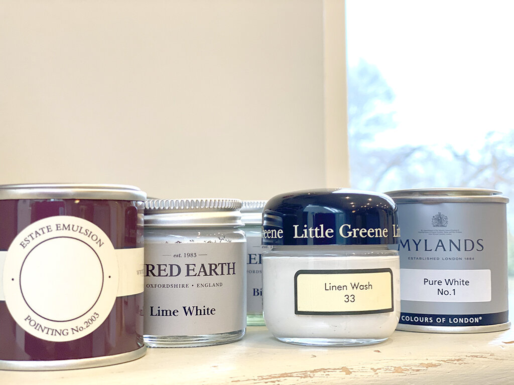
Sample pots
I would always recommend that you buy sample pots, paint on large pieces of paper, and hold them around the room to see how the light affects the colours during the day and evening.
I hope this has given you the confidence to make considered choices and enjoy the process as you view the entire room.
If you need further guidance in colour planning and confidence in choosing paint colours, please check out my design services.
