
Interior Colour Psychology: Discover Your Colour Direction
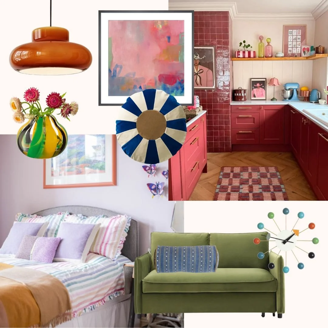
Colour has a huge impact on how a home feels. In interior design, the colours you choose can influence mood, energy and atmosphere, helping a space feel calm, uplifting, welcoming or restful. Whether you are redesigning a single room or refreshing your whole home, understanding colour psychology can help you create spaces that support the way you want to live.
If you are unsure where to begin, take our Colour Psychology Quiz to discover the colours you naturally gravitate towards in your home.
Here are some key colour pairings and how they can affect the feeling of your home.

Blues & Greens: Tranquil & Restorative
Blue and green are the ultimate colours for creating a sense of peace and relaxation.
Blue is known to lower stress levels and promote a feeling of calm. It’s a fantastic choice for bedrooms and bathrooms where serenity is key.
Green, on the other hand, brings a sense of renewal and balance, making a space feel fresh and connected to nature. Whether you opt for soft sage greens or deep ocean blues, these hues turn any room into a soothing retreat.
Add neutrals such as beige, warm white and taupe, these muted tones soften deeper blues and greens, keeping the space calm and airy.


Yellows & Oranges: Energizing & Uplifting
If you want to inject positivity and warmth into your home, yellow and orange are the way to go.
Yellow is associated with happiness and optimism, making it a great choice for kitchens and living areas where a bright, cheerful atmosphere is desired.
Orange, with its rich warmth and vibrancy, encourages creativity and social interaction.
However, because these colours can be quite stimulating, they work best as accents, or muted with earthy tones such as terracotta, olive green and warm grey, these colours ground vibrant yellows and oranges, preventing them from feeling overwhelming.


Reds & Pinks: Bold & Inviting
Red and pink are powerful colours that bring warmth, energy, and a touch of romance to a space.
Red is known for its ability to stimulate conversation and appetite, making it a great choice for dining rooms and social spaces. Whether used in deep, dramatic shades like burgundy or as vibrant pops of colour, red creates a lively and welcoming atmosphere.
Pink, on the other hand, adds softness and elegance. Blush and dusty pinks are perfect for living rooms, creating a cosy and uplifting ambience, while bolder pinks can add a playful and modern twist.
When paired with cool greys & deep browns such as charcoal, soft grey and chocolate it can make a home feel warm, stylish, and full of personality.


Choosing the Right Colours for Your Space
When selecting colours for your home, consider how you want each room to feel. Do you need a restful retreat? Opt for cool blues and greens. Want to boost creativity and energy? Introduce warm yellows and oranges. Looking for a bold, inviting space? Reds and pinks can add warmth and vibrancy.
By understanding the psychology of colour, you can design a home that not only looks beautiful but also enhances your mood and well-being every day.
Ready to work together? If you'd like help creating a colour palette or interior scheme that feels right for your home, I'd love to help. We work with homeowners and boutique hotels across Bath and beyond.
Explore our services: Let's create together
For more inspiration, check out our blog on Essential mood boosting ideas to create a happier home
Explore our Colour Psychology Guide: How to Choose Colours for Your Home: A Practical Guide to Colour Psychology
What colours make you feel most at home? If you’d like personalised guidance, please get in touch for a 1-2-1 colour consultation to help you find the perfect palette for your home.
Happy mood boosting!
Lola x
