
Top 5 Blue Interior Colour Schemes
An interior designer’s guide to the best colours to pair with blue. It can be hard to decide on the right shade of blue and the best colours to pair with them. I’ll share 5 beautiful rooms using different shades of blue to inspire your interior design schemes.

Ink blue
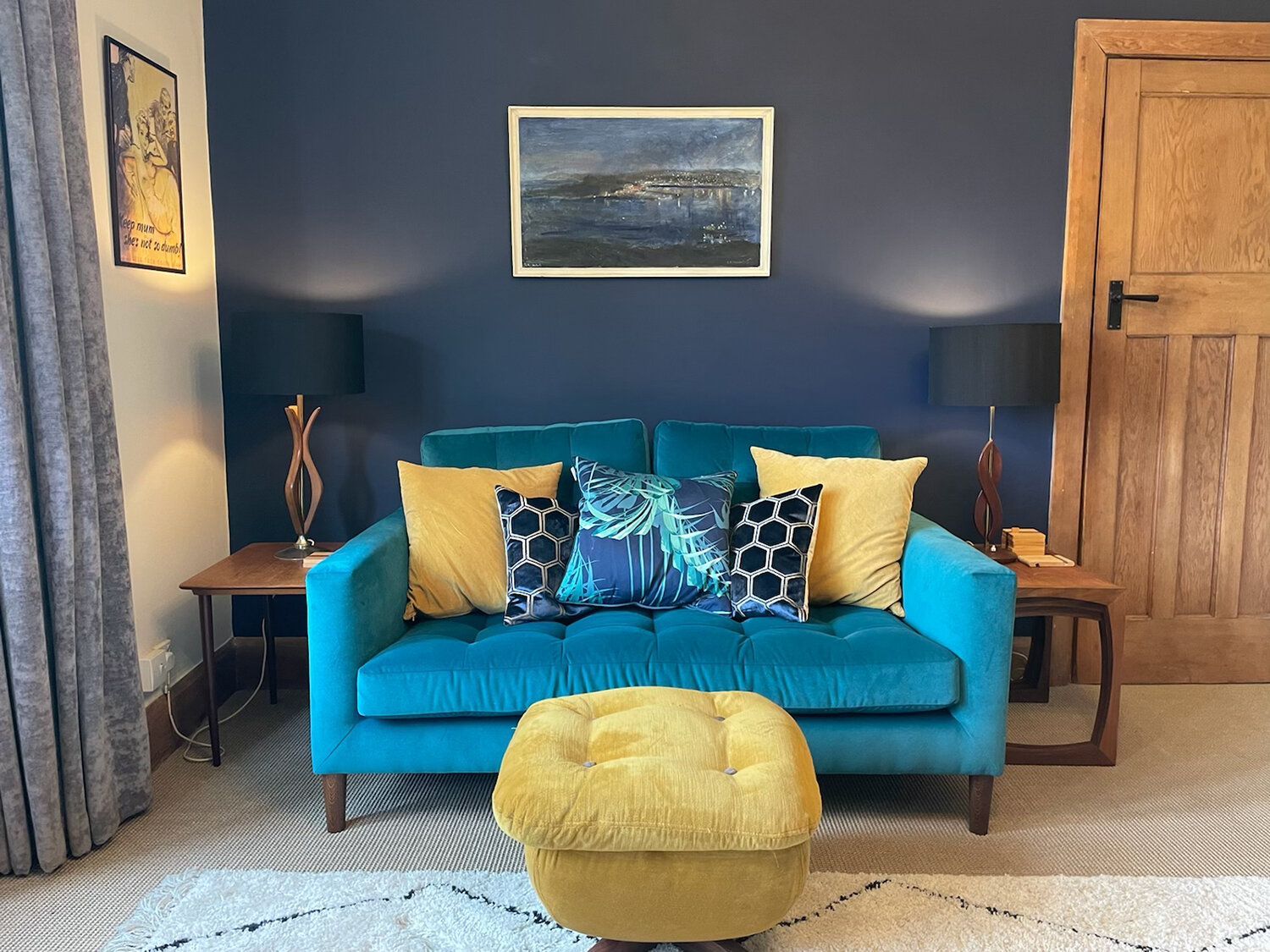
The image above shows the mood board and completed sitting room restyle of a student who came to one of my colour workshops last year. Shelley came with an inky blue paint, Immerse by Elle Decoration as her base colour. During the workshop we discuss design style, colour combinations, fabrics and textures. Shelley’s colour palette is rich and luxurious. Using ink blue mixed with aqua and gold feels sophisticated and yet it is tranquil and inviting. I love the combination of her vintage style mixed with a modern colour palette, she uses lots of soft textures, marrying the old and the new whilst incorporating natural elements which helps bring it all together.

2. Cobalt Blue
A peaceful tonal wallpaper Designers Guild has created a cobalt blue ombre wallpaper -Saraille, a stunning design shading from intense blue through to white from bottom to top, or top to bottom.
For a vibrant cobalt blue paint, try the new colour Lick paint -Bold cobalt NHS blue, BLUE 111 plus all proceeds from Blue 111 get donated to NHS charities!
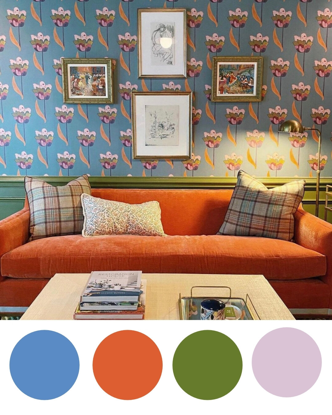
3. Steel Blue
A tried and tested complementary colour combination of blue and orange. Getting the best shade to hit the perfect contrast isn't always easy, but the image above featuring Ottoline Devries gorgeous wallpaper Tulip in sea blue is just the right balance. I love the introduction of pink and olive green in the colour palette, which softens and melts the colours together. This interior scheme is a study and cleverly designed by Maggie Dillion.

4. Turquoise Blue
A dining room of opulence, intrigue and middle eastern grandeur. The Osborne and Little Azari wallpaper by Matthew Williamson was influenced by the Persian Azari style of architecture, a stylised design of peacock feathers. The large and bold design makes a statement, perfect in a dining room. The dark intricate wooden furniture with the hint of turquoise on the frames compliments the metallic as the pale and raspberry pinks warm up the scheme.
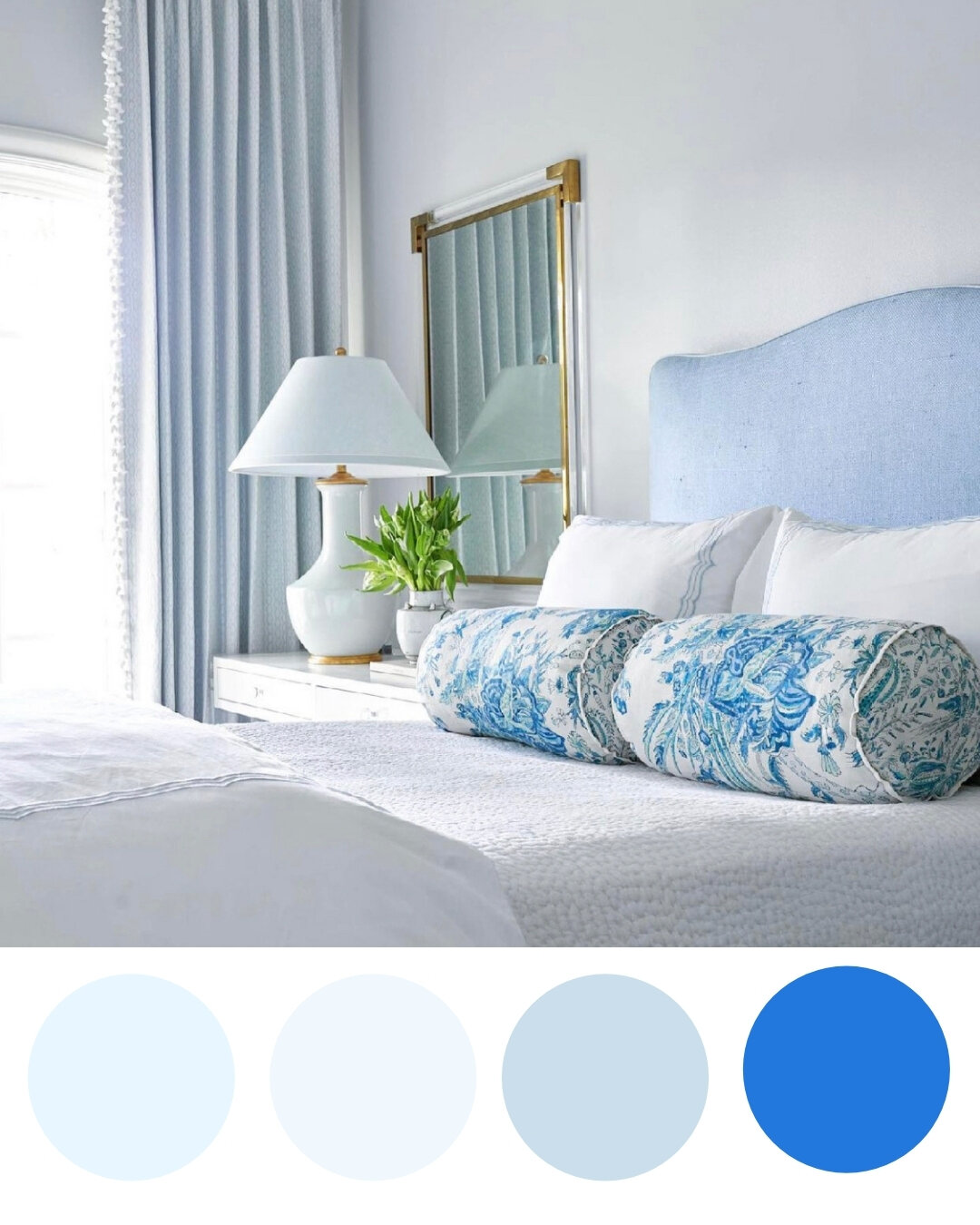
5. Powder Blue
Blue is the most popular choice when decorating bedrooms, promoting peace and calm. A delicate subtle powder blue can be all you need, with crisp white bedlinen and soft fluffy pillows which encourages sleep, rest and relaxation. A colour scheme to create a sanctuary, your place to be quiet and recharge the batteries. Little Greene has a Paint called Delicate blue, that has calm written all over it.
